Rover
Redesign of the Rover application's interaction design for improved usability.
Background
Timeline: 7 weeks
Role: UX Designer, Information Architect, UX Researcher
Tools: Figma
Overview
Rover is a web-based and mobile application that connects pet owners with sitters who can provide services such as boarding, walks, and house sitting internationally used. All pet owners care for their pets but sometimes they need some help. Rover is the place they can turn to to find that help. The platform allows owners to browse a long list of available sitters in their area to find suitable candidates. Current offered services include: boarding in sitter’s home, daycare in sitter’s home, 30-60 minute walks, house sitting in the owner’s home, and 30-60 minute drop-in visits.
Problem Statement
The Rover application poses challenges for pet owners and sitters. The matching process is complicated and often results in owners needing to cast a wide net in reaching out to multiple sitters in hopes of finding a good match. Sitters receive requests that often do not match pets or availability they would accept. The application needs to be able to streamline the matching process, maintain the safety of people and pets involved, and efficiently allow booking to be scheduled between owners and sitters.
Solution #1
Add a new feature to improve the matching process between sitters and owners. This new matching system will aid a decrease in the turn down rate, decrease the time owners spend on finding a sitter, and gives sitters more information about the owner and pets needs before they accept a booking.
Solution #2
Add a new feature to bring more of a community environment for sitters. Sitters notes them to share advise and tips when accepting a client, allowing sitters to be well-prepared for their scheduled services and aware of other sitters’ experiences they share through the new feature.
Solution #3
Update current Rover UI
Research
Competitive Analysis
Wag!
A direct competitor for Rover is Wag. Wag differs from Rover in the option to provide on-demand walks. This is a main reason many Rover sitters have chosen Rover over Wag. There is a lot of uncertainty and risk in taking a pet into your care with no information other than what is written on the profile. One feature I like that Wag offers is the option to set a preferred walker. This works by sending the notification to your preferred walkers when you are requesting before sending to all sitters in your area. This would look different in Rover due to the lack of an on-demand option, but this feature has the possibility to be beneficial.
Care.com
An indirect competitor for Rover is Care.com. Care.com is a web and mobile based platform connecting users to find housekeeping, tutoring, childcare, petcare, and other like services. What I liked about this platform was the extensive options offered to filter when exploring results. Rover only uses dates needed, price and distance to show sitters to users. Care.com uses distance, price, experience, age, a fill in field, and additional information. While all of these criteria would not apply to Rover, a broadening of the criteria used by users on the Rover platform would be beneficial in decreasing the time spent by users in finding a sitter by increasing the adequacy of results shown to users.
Secondary Research
Despite time constraints, I proactively initiated research utilizing guerrilla tactics within Rover sitter groups on social media. The focal point was understanding the target audience and their challenges. I utilized Reddit forums and Rover’s app reviews on the iOS App Store to gain insight. Some overarching pain points:
Issues with repeated “bad” clients — those who withhold pertinent information from a sitter, with no way to communicate with other local sitters
Owners being turned down or ghosted by sitters, as well as sitters being sent booking requests that don’t match their availability or pet preferences.
Lack of tools for sitters to search, sort, or filter bookings and messages.
Absence of customization for location settings corresponding to different service types.
Major Changes
Sitter’s Notes
The sitter’s notes feature was added onto the preexisting service (House Sitting in the example) information screen. It was placed here as it pertained to pet information. The ability to make a note on a pet profile is reserved for sitters who have successfully completed a booking with that pet. The design is intentionally minimal to make the focus on this screen the content.
Updated Inbox
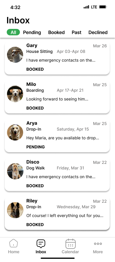
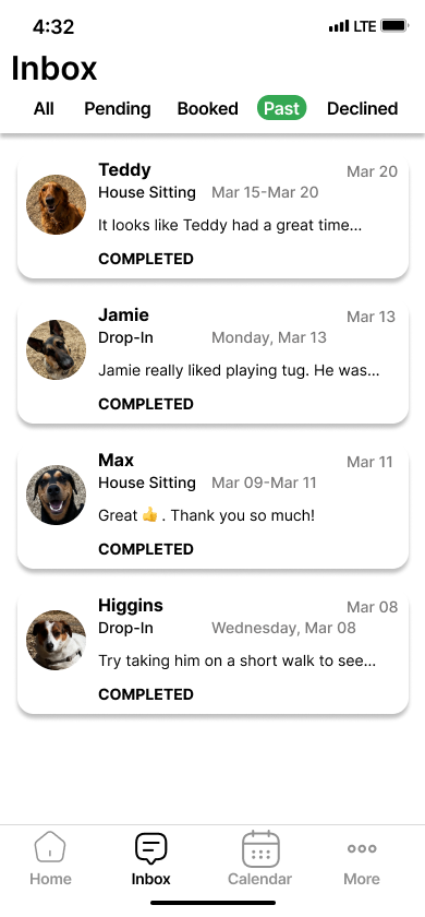
For the inbox, I wanted to maintain the current sections but present them in a more user-friendly way. The current design uses icons in the upper left corner that are hard to distinguish between being in the past/archived section vs. the pending/upcoming section. With that in mind, I placed them in a breadcrumb header and also added an ‘All’ section for users who want to see all requests/conversations.
The matching system was incorporated into the onboarding for new sitters. The goal is to intake information about sitter’s preferences, information about pets provided from owners, and present sitters and owners with a percentage match. This feature will streamline the matching process, decrease turn-down rates, and increase the positive user experiences.
Old Design
New Design
Matching System
Information Architecture
Screenflow
Creating screenflows was pivotal in structuring user interactions. Through low-fidelity screenflows, I established a visual framework for key user pathways. This step provided a clear roadmap to identify potential challenges, streamline navigation, and ensure alignment with user needs.
Design
The completion of the screen flows provided a foundation to layout the wireframes for the rest of the project. Using Figma, I progressed from low fidelity to high fidelity wireframes. This phase marked the transition from design concepts to refined and user-tested solutions, setting the stage for a polished and effective interface. These are a sampling of key user interactions.
Low Fidelity Wireframes
High Fidelity Wireframes
Interactive Prototype
From wireframes, I transitioned to interactive prototypes using Figma to simulate user interactions, transitions, and functionality. Through iterative testing, I refined the prototype's usability and identified areas for enhancement, ensuring alignment with user needs.
Results & Lessons Learned
As a personal project, I was super excited to being working on different iterations. I found genuine excitement in continuously revisiting my wireframes, fine-tuning layouts, structures, and interactions to enhance the functionality of this proposed redesign. As a result of this project, I was able to implement:
a UI update to the inbox and overall design
a feature called sitter’s notes to foster a better sense of community and increase safety for sitters
a new matching system feature to streamline the process of booking between owners and sitters
Due to time constraints, I was not able to implement every idea I had in mind. If I had more time I would look into addressing the possibility of further customizability for sitter and their schedule. Currently updates to a sitter’s calendar cannot be altered by service and all updates affect the entire day selected. Given more time, I would also conduct usability testing to verify the success of my designs with users.


